Typographical Portrait and Magazine Layout
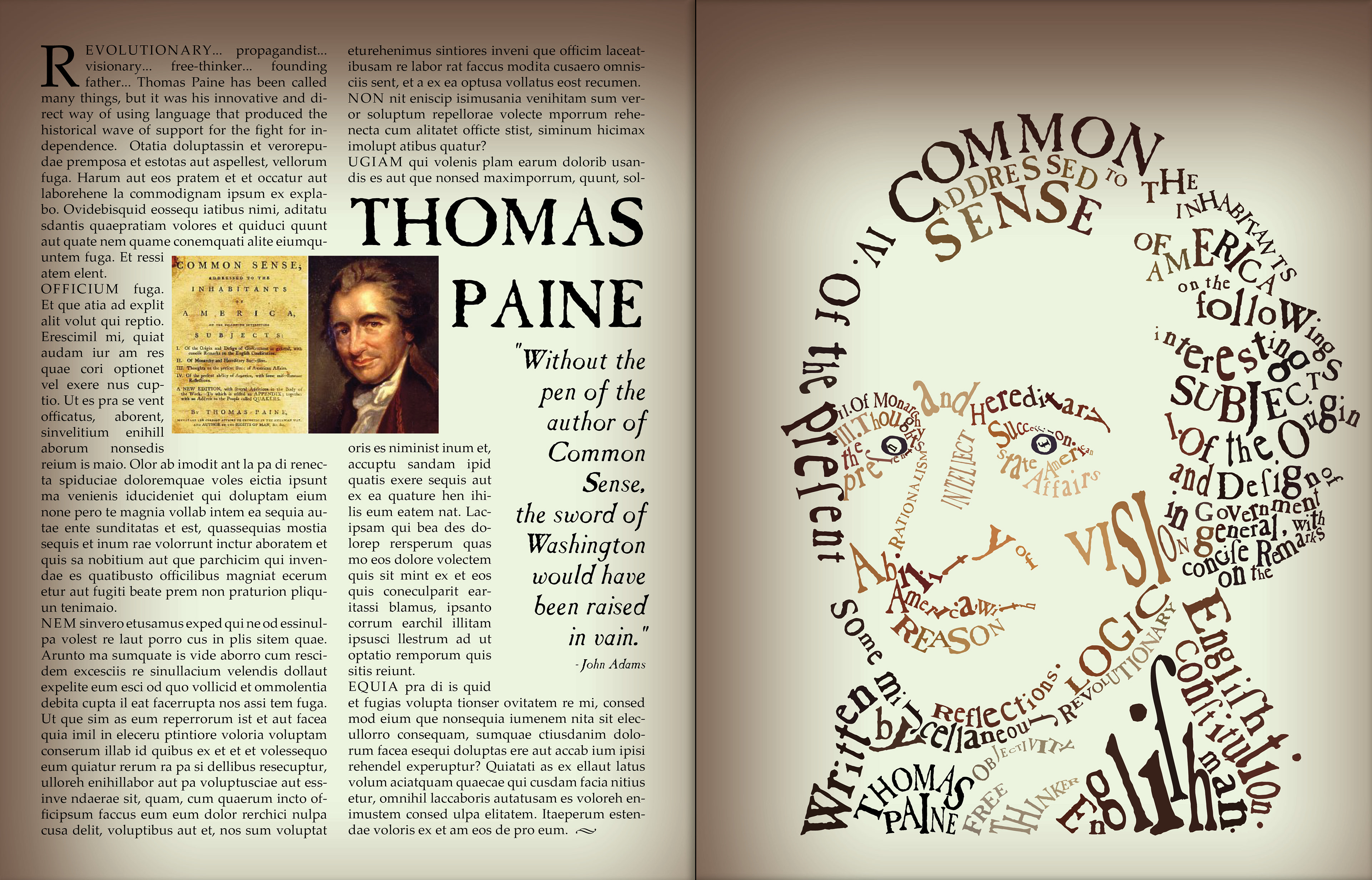
Using an image of a painting of Thomas Paine in a locked background that was faded to 30% opacity, I created a portrait of Paine using typography that was similar to that used in the publication of the original Common Sense pamphlet. I kept the colors muted but warm, much like the color palette used in the original oil painting.
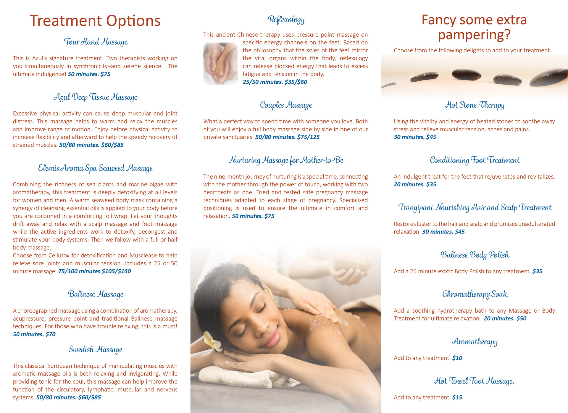
Tri-fold Brochure Design

Using provided text and some of the provided imagery, I chose a color theme, typography, and layout for this massage salon. I used Photoshop to manipulate images (such as creating fading opacity masks for the upper and lower edges of interior images). The inside spread is below.
Program Design for NCCC
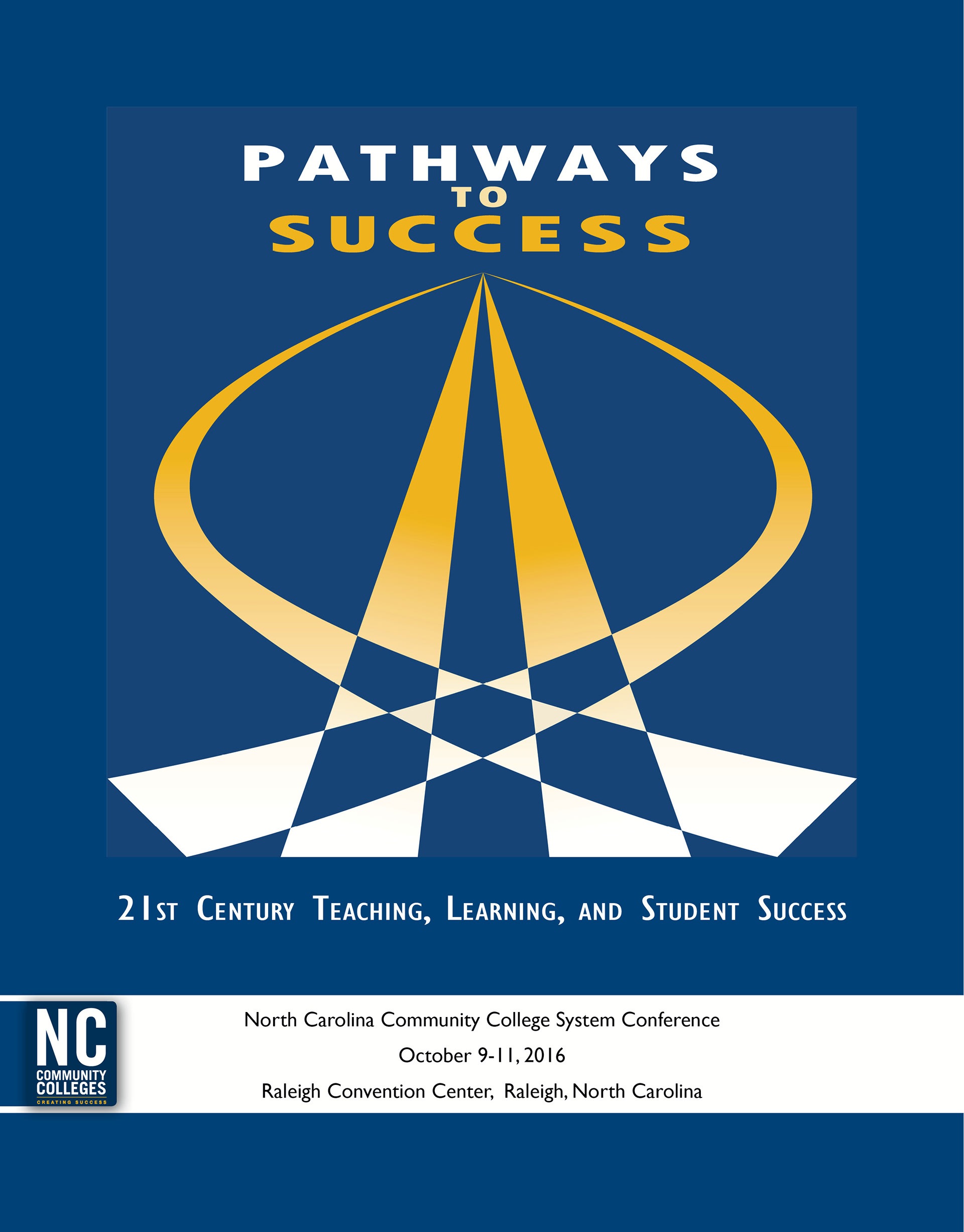
Using only branding color scheme and tab logo, I designed a cover for the North Carolina Community College System Conference for 2016. The Logo design was done in Illustrator and the layout in InDesign.
Promotional Newsletter Mailer

I created a double-fold tabbed mailer to promote the town of Schäftlarn, located just southwest of Munich, as a base for exploring Bavaria and Munich. The inside spread is below.

Book Jacket Design
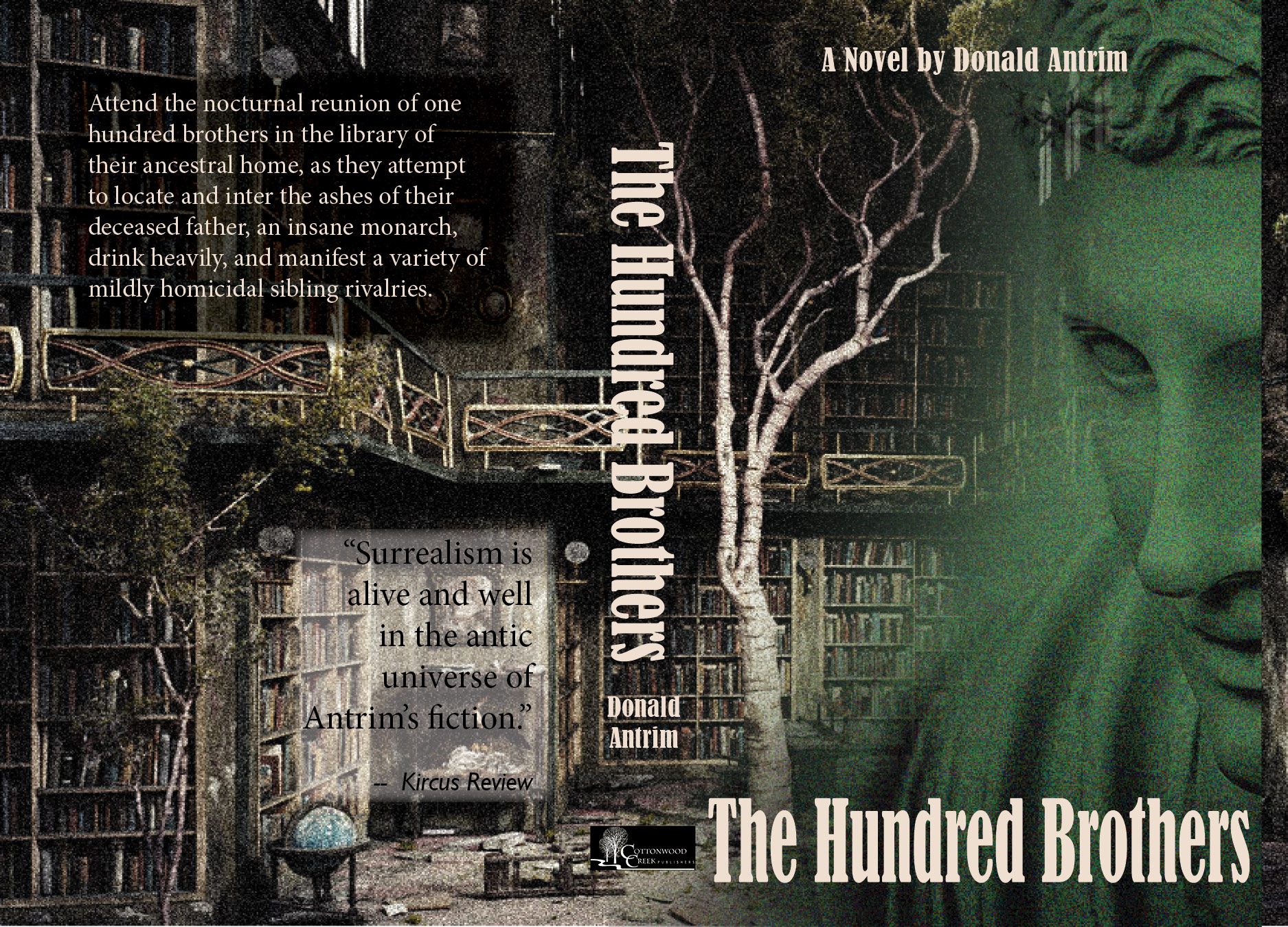
This was a design that had to incorporate at least 2 images that discussion participants contributed. This design encompasses front, back and spine, with a bleed.